
Plenty of businesses put real effort into designing a logo, then let it drift. The website uses one shade of blue, the van uses another, and the reception sign still carries a version from five years ago. Each mismatch seems minor on its own, yet together they make a company look less organised than it really is.
Consistent visual branding means every point of contact uses the same logo, colours, fonts and imagery in the same way. When customers see that consistency across a shopfront, a social media post and an invoice, they recognise the business faster and trust it more. That recognition builds quietly over time, and it shapes how people judge everything from pricing to service quality.
Reasons Consistent Visual Branding Matters for Businesses
Here are five reasons to keep your visual identity aligned everywhere it appears:
1. Instant Recognition Wherever Customers Look
People remember shapes and colours long before they remember names. When a logo, palette and typeface appear the same way every time, customers start to identify the business at a glance, even from across a busy street or while scrolling quickly through a feed.
Physical spaces play a big part in building that memory. A 3D foam logo mounted behind a reception desk gives visitors a bold, dimensional version of the brand mark the moment they walk in. Because it matches the logo on the website and business cards, it reinforces the same image they have already seen online.
2. Stronger Trust and Credibility With Customers
A consistent look signals that a business pays attention to detail. Customers often assume that a company careful with its presentation will be just as careful with its products, deadlines and aftercare. Retail and showroom environments show this clearly.
Slat wall signage that uses the correct brand colours and fonts ties product displays back to the company behind them, so shoppers feel confident about who they are buying from. Mismatched or homemade signs, on the other hand, can leave people questioning the quality of what sits on the shelves.
3. A Professional Experience Inside the Workplace
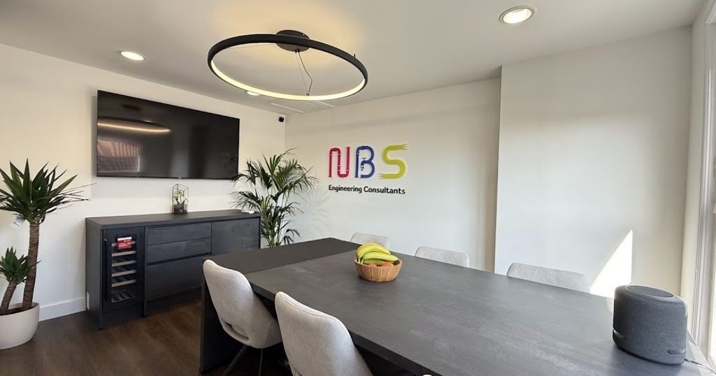
Branding does not stop at the front door. Corridors, meeting rooms and private offices all shape how clients and staff feel about a business, and gaps in consistency stand out quickly once someone is inside the building.
Small details carry surprising weight here. Aluminium office door signs printed with the same typeface and colour scheme as the main signage help visitors find their way around while keeping the interior polished. They also resist scratches and fading in busy, high-traffic areas, so the finish stays sharp for many years with minimal upkeep.
4. A Stronger Sense of Team Identity
Staff respond to strong branding too. When uniforms, internal documents, presentation templates and office walls all share one visual identity, employees feel part of something organised and purposeful.
That sense of belonging often shows in how teams represent the company. A branded welcome pack or a uniform email signature might seem like a small touch, yet it tells new starters what the business stands for from their first day. Employees who feel proud of their workplace speak about it more confidently with clients and carry the brand into every conversation.
5. Better Long-Term Marketing Results
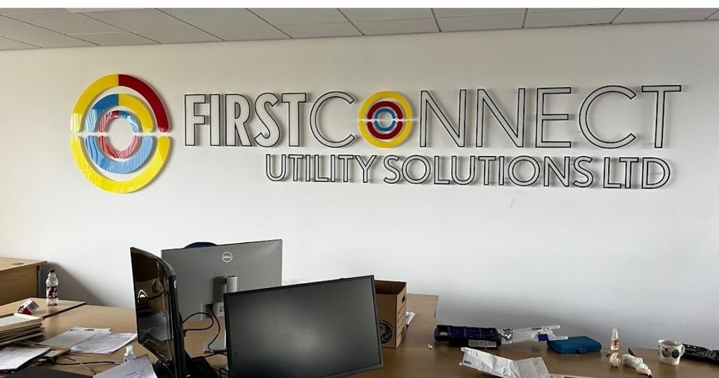
Every advert, brochure and social post adds to the recognition a business has already built, but only if each one looks familiar. Inconsistent designs reset that progress, forcing customers to work harder to connect a new campaign with the ones before it.
A unified identity lets marketing spend go further. Campaigns become quicker to produce because designers follow set guidelines, and customers respond faster because they already know who the message is from. Over months and years, that familiarity turns into loyalty.
How to Keep Your Visual Branding Consistent
Before refreshing any signage or marketing material, check these points:
- Create brand guidelines. Document logo versions, colour codes, fonts and spacing rules so every designer and supplier works from the same reference.
- Audit what already exists. Walk through the premises and review the website, vehicles and print materials to spot outdated logos or off-brand colours.
- Match materials to the setting. Indoor signs, outdoor fascias and printed displays each need finishes suited to their environment, but the design should look identical on all of them.
- Update everything together. Replacing one sign at a time often creates temporary mismatches, so plan rebrands in phases that cover related items at once.
Turning Consistency Into a Competitive Advantage
Consistent visual branding rarely happens by chance. Strong brands treat every sign, screen, vehicle and printed page as part of one connected identity, then check regularly that each piece still fits as the business grows.
Start by gathering examples of your current branding in one place, from signage and stationery to social media graphics, and comparing them side by side. Any small differences will stand out quickly, and fixing them gives customers a clearer, more trustworthy picture of the business every time they come across it, online or in person.